This is the list of interesting changes and updates for Cubetrix. To read about Cubetrix itself, go to the Cubetrix blog post.
Table of contents
- Table of contents
- 2024-08-30 3(1.2) - On more devices
- 2024-08-30 4(1.4) - High score, and drag-to-look
- 2024-09-01 5(1.5) - high maxValue, and better dragging
- 2024-09-01 1.6 - Reverted the drag gesture
- 2024-09-03 2.0 - Hamburger menu, and more
- 2024-09-04 2.1 - Settings tweaks
- 2024-09-09 2.2 - Instructions and Translations
- 2024-09-12 2.3 - Ratio
- 2024-09-25 2.4 - Accessibility
- Device based defaults
- Missing cyan ratio info
- Customisation of forground/background colours
- Opacity
- Re-center button
- 2024-09-26 2.5 - Navbar fixes
2024-08-30 3(1.2) - On more devices
I tested Cubetrix across several devices of different form factors, and ages. So many, in fact, that when my wife walked in and saw my desk covered in devices, she made the comment that it looks like I’m running an intricate drug ring.
Then when I released the app, and sent the link to several friends. The first person I chatted with wasn’t able to install it. Specifically:
The game uses the phone’s gyros for navigating around the 3D space. I was expecting some very old phones to not have these, but apparently even some modern budget phones don’t have them yet. I already had the fall-back functionality for this use-case, but had accidentally set gyros as required in Google Play. So I’ve now made them optional, but you will definitely have a better experience if your phone has gyros.
2024-08-30 4(1.4) - High score, and drag-to-look
I’ve skipped 1.3 so that versionCode and versionName loosely match. I was bending my head on the previous version when trying to debug an issue with a friend.
High score
All future games you play will now keep the high score on your device. Like all other saved data, nothing is transmitted off your device.
The high score is displayed in a fainter yellow, just above the current score, which is a stronger yellow.
Drag to look
Probably the more exciting update is drag-to-look. This is a way of replicating the gyro functionality on a device that doesn’t have a gyro, simply by dragging your finger around.
Normally, to do a swipe, you brush your finger across the screen in a particular direction. To do a drag, you simply hold your finger longer than about half a second. The number displays will all go grey to give you feedback that you have successfully entered this mode. At this point, you can move your finger around to look around.
The normal re-centering gravity is turned off while you are dragging, because I found the gravity annoying while testing it on a phone that doesn’t have a gyro.
2024-09-01 5(1.5) - high maxValue, and better dragging
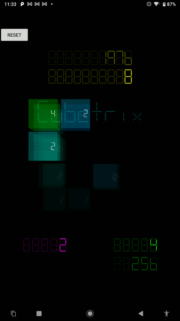
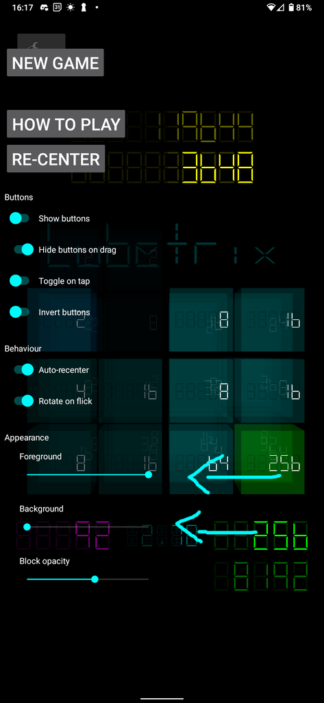
In this screenshot:
| What | Colour | Value in the screenshot |
|---|---|---|
| Score | yellow | 8 |
| High score | dim yellow | 1976 |
| Max value | green | 4 |
| High max value | dim green | 256 |
| Moves | purple | 2 |
high maxValue
I’ve added the all-time high max value (dim green). It’s like the dim yellow all-time high score, but for the green highest value block.
I know that some people use the high score to mark their progress, which is totally fine. But I find the max value to be a more interesting measurement of progress.
Dimmed high values
A common bit of feedback was that the high score was a bit distracting. Now that I’ve added the high max value, this would be even more the case. So I’ve dimmed both sets of numbers some more.
I had actually played with this when I first introduced it, but with different phone screens having different gamma values, one of the phones that I tested on felt too dark. But the majority of phones were way too light. So it seems right to bring it down a bit.
Drag gesture start
I’ve made the drag gesture start dragging from when it becomes active instead of when the finger first made contact. This has the affect of not having a sudden jump when the drag becomes active. I’ve reverted this. See the 1.6 update.
Recentering gravity
I used to apply the recentering gravity (the force that slowly moves the cube back into a neutral position) when ever gyro values were processed. This seemed logical at the time. But it has the effect that gravity is only calculated and applied at those times, which can be significantly less frequent that the frame rate. I’ve therefore moved those calculations to the draw function so that it’s consistently applied when a new frame is needed. It’s a light calculation that has a trivial impact on the frame generation time.
2024-09-01 1.6 - Reverted the drag gesture
Reverted the drag gesture behaviour. Users didn’t like it, because it made the action less predictable, which inhibited muscle memory. Now it will “catch-up” to your finger again rather than starting from when it becomes active.
2024-09-03 2.0 - Hamburger menu, and more
Created hamburger menu
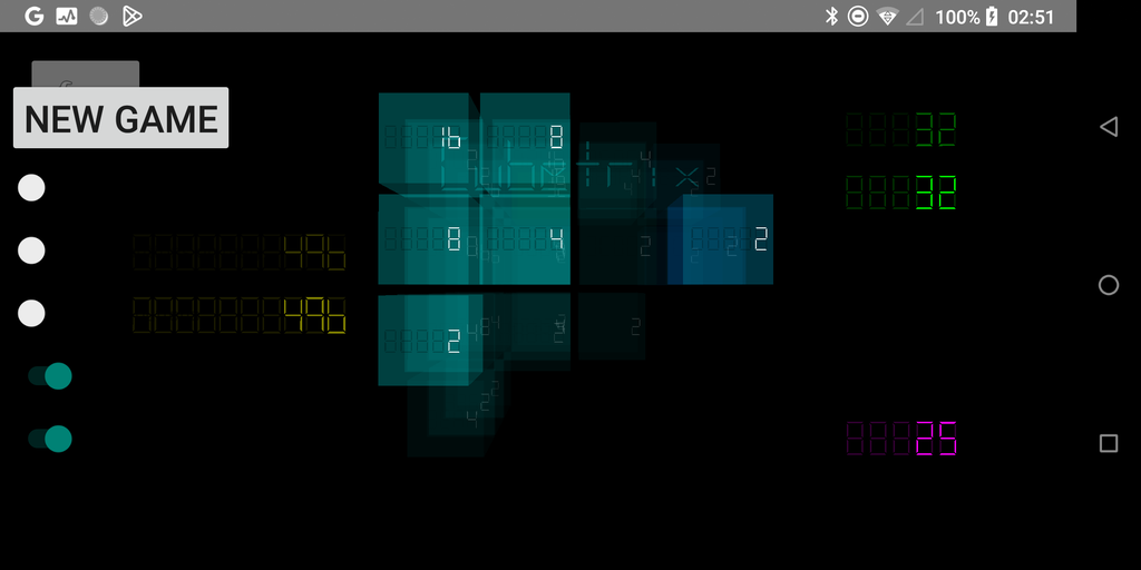
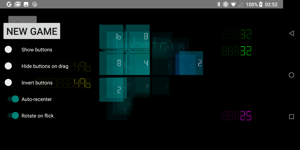
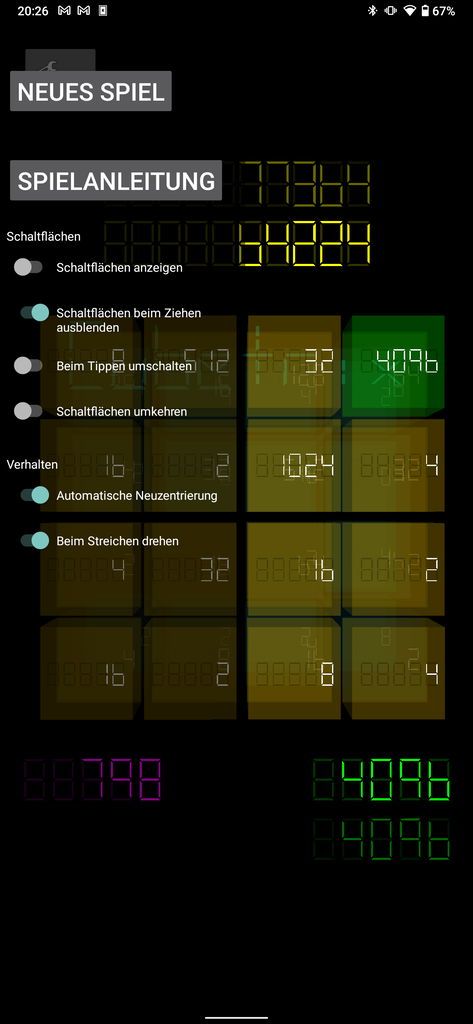
There used to be a reset button (for starting a new game) in the top left of the screen. Instead there is now a button to show the hamburger menu, which contains a “New game” button.
Below that button, there are some settings, which you can change to change how the game and User Interface behaves.
Accidental showing/hiding of the buttons
It used to be that you’d tap anywhere on the screen to show/hide the arrow buttons. I found this really annoying, so I’ve moved it to the hamburger menu.
Added settings
- Show buttons - Replaces the old functionality where you’d tap on the screen to show/hide the buttons.
- Hide buttons on drag - The buttons used to automatically disappear every time you’d drag to look around the cube. This is now optional.
- Invert buttons - Some people like to rotate the cube. Others like to rotate the view of the cube. This option addresses that.
- Auto recenter - This slowly brings the cube back to the center. It’s to cater to the slow drift that gyros have. If your device doesn’t have gyros, or you want to get the perfect angle for a screenshot, this is now optional.
- Rotate on flick - This option is mostly for devices that don’t have gyros, but might be useful for people who would prefer to use the buttons. In either case, you can now disable the flick gesture.
Fixed arrow buttons
Something I forgot to put in the release notes was that the arrow buttons didn’t show correctly on some devices. This seemed to be rare, but did happen. So I’ve improved that, and haven’t been able to find any devices that still show the problem. If you still see it, I want to know about it.
- Created a hamburger menu and placed configuration there.
- Got rid of annoying behaviour that led to accidentally showing or hiding the buttons. Instead it is now the “Show buttons” toggle in the hamburger menu.
- Created settings for commonly requested & disagreed-on choices.
2024-09-04 2.1 - Settings tweaks
Foreground colouring in the settings
This is an “own goal” moment. While implementing the settings interface, I anticipated the problem of the text being the same colour as the background on some devices. But when I tested it on a phone that I expected to have this problem, it was fine. So I chose not to do anything about it. It would have only taken me a minute, but I didn’t do it. This was the wrong decision, but it’s fixed now.
Sections
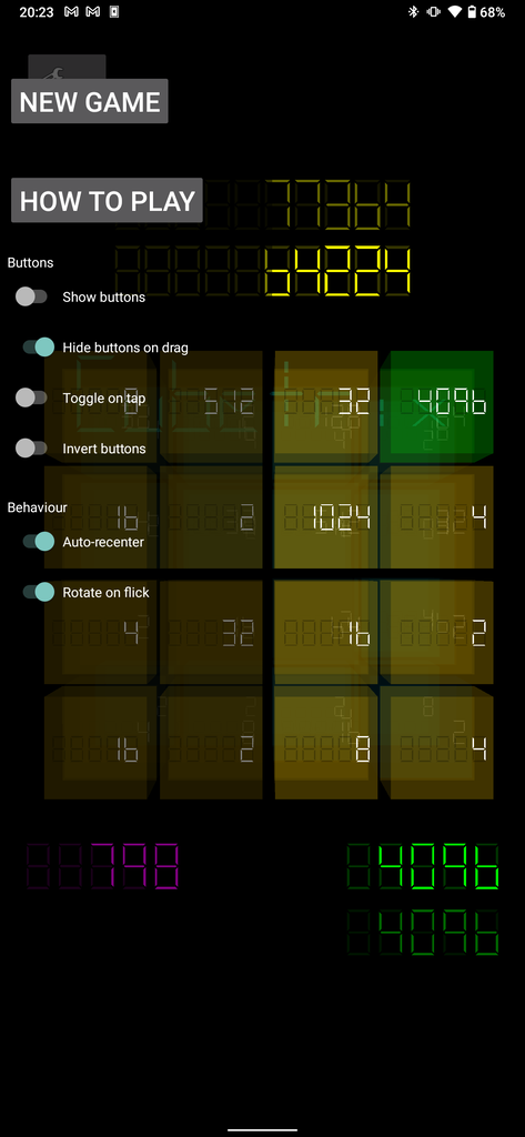
There were only 5 settings before, but they were already feeling a bit cluttered. I’ve now created sections to make them easier to skim.
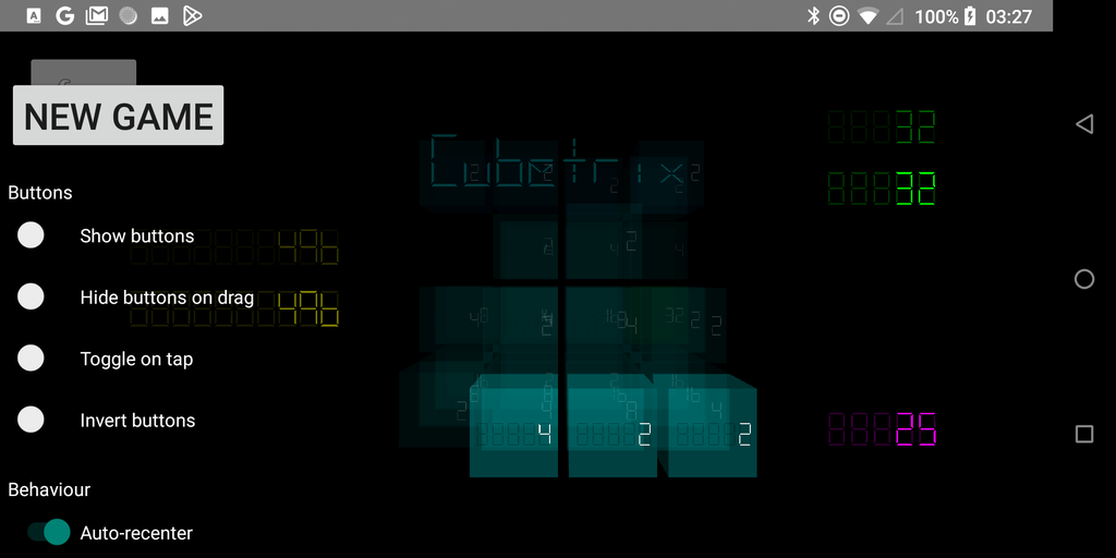
Above: There are now titled sections to make quickly skimming the settings easier.
Optional toggle on tap
Added a setting restoring the ability to toggle the buttons by tapping anywhere on the screen. I’m not sure if anyone was relying on this, but I referred to it in the original video describing how to use Cubetrix. So in the interests of making things easy, it makes sense to keep that functionality for now.
2024-09-09 2.2 - Instructions and Translations
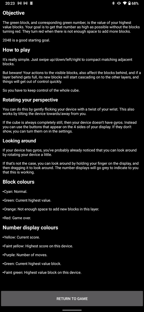
Instructions
I forgot to put this in the release notes on the Google play listing. It is:
A common bit of feedback I’ve received from people who don’t speak English, is that they aren’t sure how to play the game. This is because the video that I encourage people to watch is only in English.
To solve that, I’ve added text instructions within the app, and then…
Translations
I’ve just abstracted out all of the user-facing strings so that I can add support for different languages. In each case, I’ve used Google translate to make the translation, and when I’ve had the knowledge to do so, I’ve corrected context mistakes. There will be mistakes that I’ve missed. But it’s a start.
I’ve chosen the languages that I have chosen to start with, because I know someone who speaks that language, so it might be nice for them. And hopefully if I’ve got any serious typos they might let me know.
The currently supported languages are:
- English.
- Arabic.
- German.
- Spanish.
- French.
- Luxembourgish.
- Norwegian.
- Portuguese.
- Russian.
And you can use them by choosing the desired language in Android’s settings.
This has been a really interesting exercise, and one that I specifically waited until now because of the inertia it will add to changes involving text.
Of particular interest to me was how Arabic would behave (being a right-to-left language), and to the best of my understanding, the libraries that I’ve used have nailed it. It was also interesting to see how differently Android behaved as well (gesture directions).
2024-09-12 2.3 - Ratio
This update is entirely about the ratio. Let’s dive into that.
What
I’ve always been interested to see what the ratio is between the maxValue and the number of moves I’ve made. It’s a measure of how efficiently I’m attaining each maxValue.
Aesthetic
I’m conscious that this may not be interesting to everyone. So I’ve made it faint so that it doesn’t distract too much. Yet I love how it contributes to the hackers-style aesthetic that I’m going for. So I didn’t want it too dim.
I’m also using the extended display segments to display the decimal point. Yet, in the current opacity, they aren’t particularly visible. I played with the opacity of the illuminated segments being as they are now, while the non-illuminated segments were the same as the non-dimmed displays. The problem with that was that it wasn’t as readable as I’d like. - I’m likely to play with this further to optimise readability vs looking cool.
How the number behaves
The number is calculated by dividing the maxValue by the number of moves. So every time you make a move without increasing the maxValue, the ratio gets a little bit smaller. But then when you increase the maxValue the number jumps up.
So effectively, the ratio is a saw tooth wave. It slowly decays, and then makes a big jump from time to time.
A high number (eg 10) might be a good indication that you are playing well. While a low number (eg 2) might be an indicator that you’d not. Or maybe not… Maybe you’re biding your time and will make a big jump up soon.
In any case, I found it interesting.
2024-09-25 2.4 - Accessibility
This is actually a pretty big release, although it might not look like it at first when you look at the app.
Device based defaults
In the early versions, when you ran Cubetrix on a device that doesn’t have gyros, it would detect that and show the buttons automatically. When I made it user-configurable, this disappeared.
Now it will choose defaults based on your devices capabilities, while still being just as configurable.
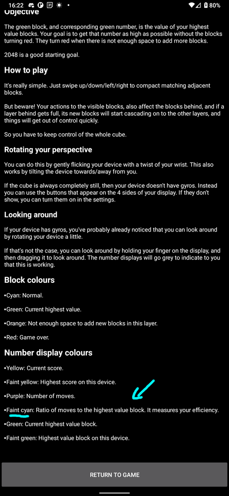
Missing cyan ratio info
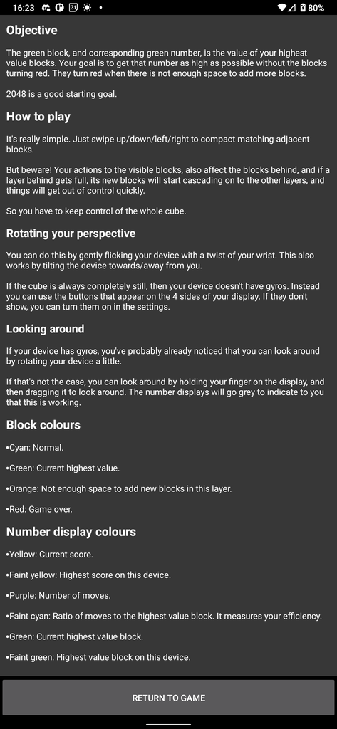
When I added the cyan ratio display, I didn’t add documentation for it, because it wasn’t important for playing the game. But it’s not obvious what it does just by looking at it, so I kept getting asked about it.
I’ve now added documentation for that into the “How to play” instructions.
Customisation of forground/background colours
This is the biggest change of the update.
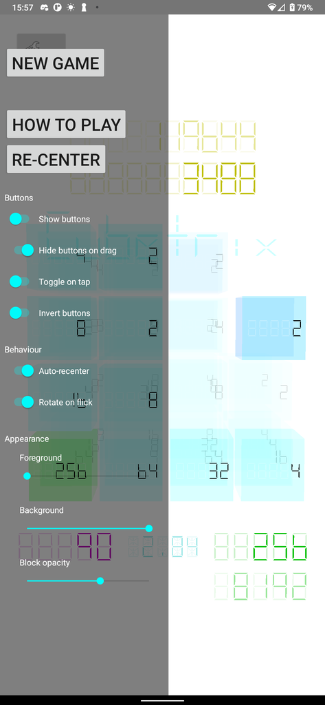
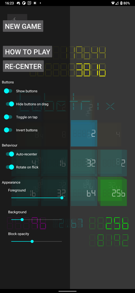
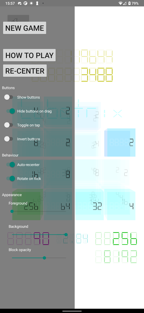
It will now detect if your phone is in dark mode, or light mode, and will choose the foreground, background, and opacity values based on that. You can customise these values to your liking. And the values that you change will be associated with the mode that your phone is currently in. So you can do lots of cool things like making it easier to see outside, or keeping the dark aesthetic while making it dimmer at night.
The light mode default settings lose the the aesthetic that I was going for, but will make a big positive difference for those who are affected by it. If you don’t like it, it’s 2 taps to get the old behaviour.
If you put one of the two sliders less than 50% of the range away from the other slide, the slider that you’re not touching will automatically invert. You can adjust it to where you’d like afterwards. The purpose of this is to stop you from accidentally putting the app into an unusable state. At the moment, that 50% seems reasonable, but if I hear that someone needs a lower contrast than that, I’m happy to reduce it a bit.
I have a big blog post in the works which goes into why these settings are important for accessibility, but for now, just know that this caters to make colour/brightness based accessibility challenges.
Opacity
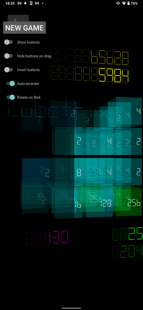
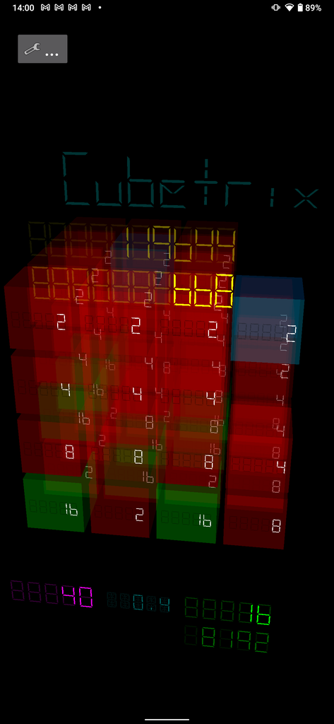
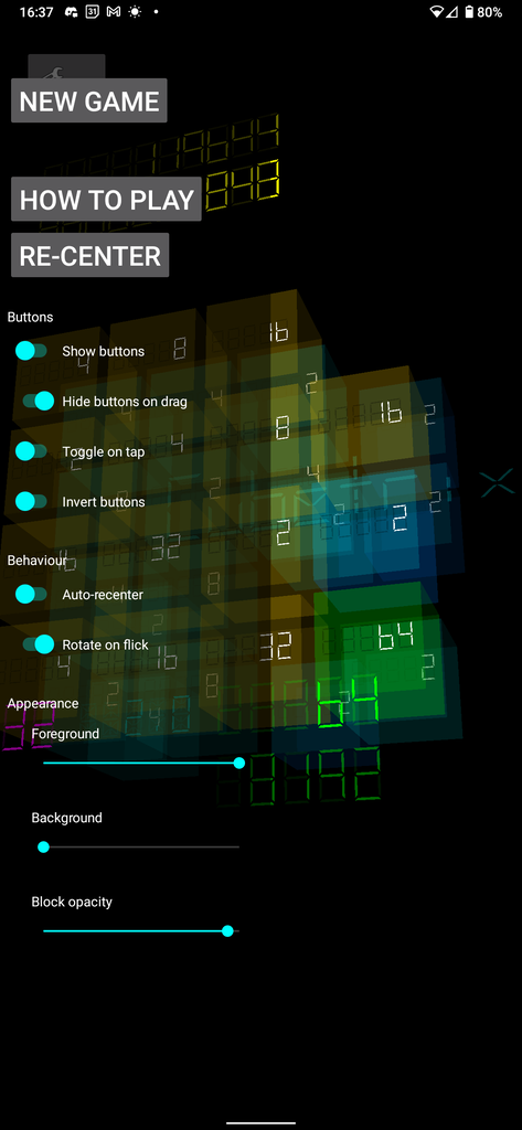
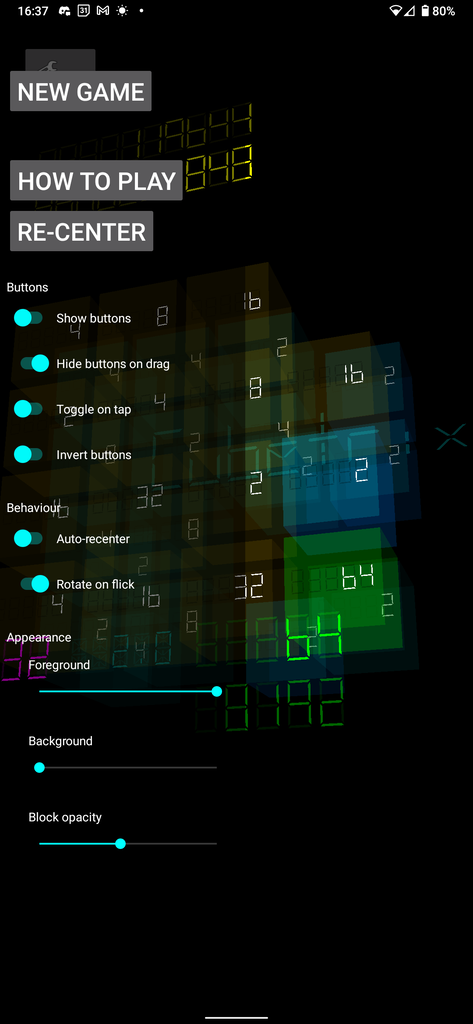
This is an extension of the colour customisation above. This slider adjusts how transparent the cubes are, while leaving the numbers intact. This makes it easier to see the layers behind the front one when you rotate the cube. It also gives you a mechanism to reduce the intensity of the colours.
In the above examples, take a look at the 4 just behind the 8 near the top right.
I think that it actually looks nicer when it’s a bit more faint, so I’ve reduced the default to around half way. But if you prefer it the way it used to be, you can drag that slider all the way to the right.
Re-center button
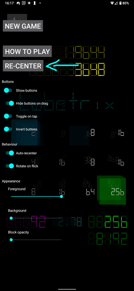
A complaint that I kept getting was that the auto re-center takes too long under certain situations, such as when you resume the app. I understand why this is happening, but don’t yet have an elegant solution that doesn’t come with big consequences. So in the mean time I’ve provided a button in the side bar to perform an instant re-center.
2024-09-26 2.5 - Navbar fixes
Fixed slider drag
Before, the DrawerLayout was catching the drag gesture, which made it really hard to hit the sliders. Since that gesture didn’t make a lot of sense for Cubetrix anyway, I’ve disabled that gesture, and you can tap away instead.
Fixed slider and toggle colours
The slider and toggle colours used to be light in dark mode, and dark in light mode. But because I’ve got the DrawerLayout configured to be dark, this didn’t make sense. So I’ve set these to be bright all the time, which makes it consistently usable in both light mode and dark mode.
